
Symbology
A model opens with no symbology. The app draws every node in one color and every link in another, and a run does not change that by itself.
You color the network yourself, and it is the fastest way to read a model. A pressure ramp finds the low corner of a network in a second. A diameter ramp shows you the trunk main. A velocity ramp shows you which pipes do nothing.
This page covers the Node symbology and Link symbology sections at the top of the Map tab. Zone symbology and Customer points are under them. The rest of that tab holds the base maps, the layers and the projection. See The map and its layers.
Coloring by a property
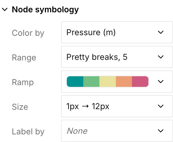
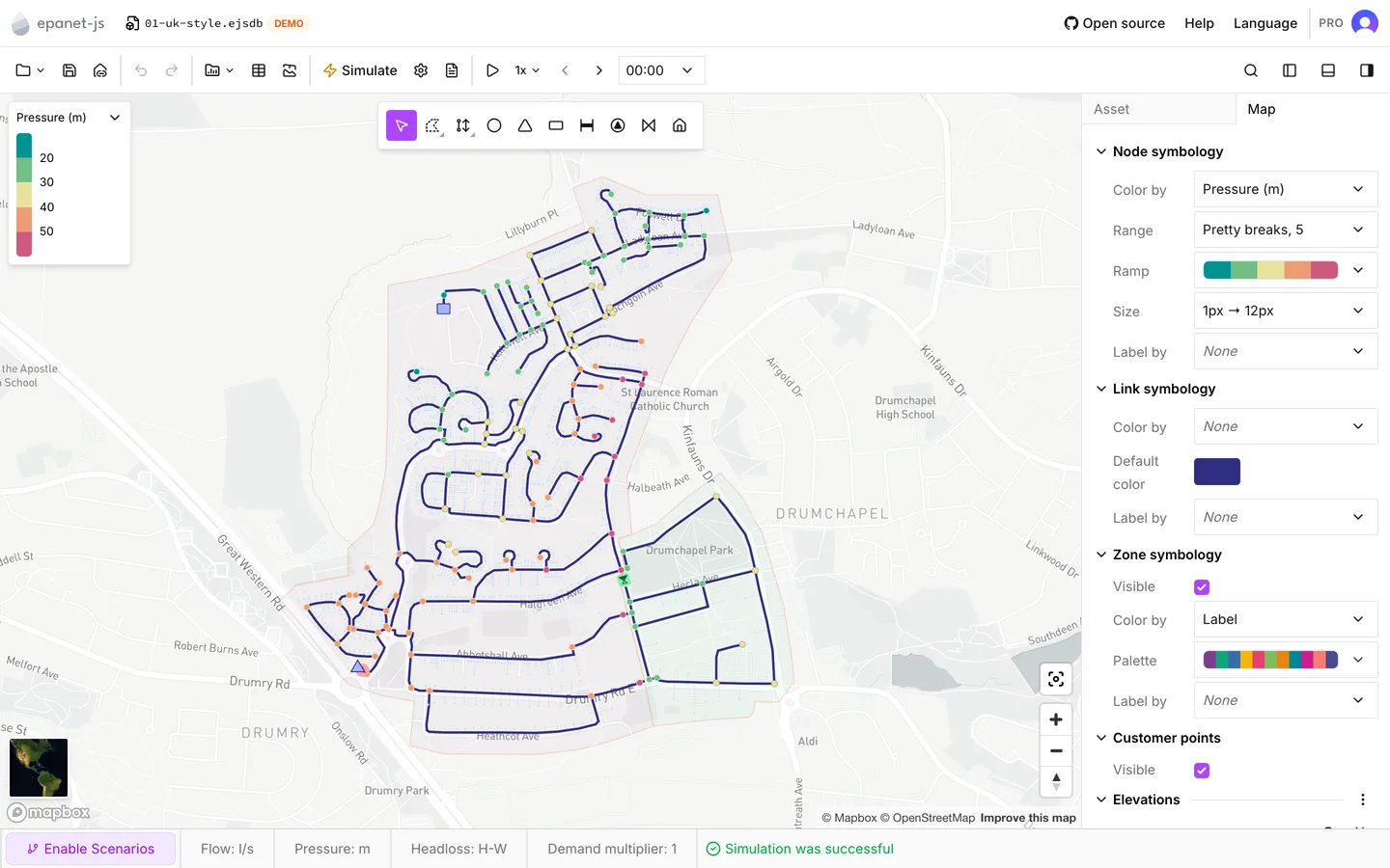
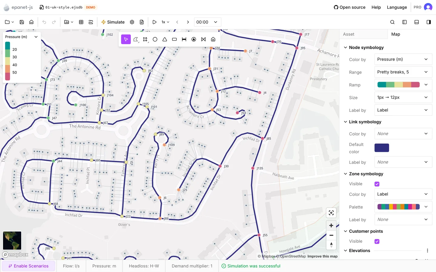
Section titled “Coloring by a property”Color by in either section takes one property. When you choose a property, the map recolors and a legend appears at the top left. The section also grows Range and Ramp rows to tune the colors.
| Nodes | Links | Needs |
|---|---|---|
| Elevation | Diameter, Roughness | Nothing. These are model attributes |
| Pressure, Actual demand, Head | Flow (abs.), Velocity, Unit headloss | A completed run |
| Min pressure, Max pressure | — | An extended period run |
| Water age | Water age | A run with water age as the quality analysis |
| Water trace | Water trace | A run with a trace analysis |
| Chemical | Chemical | A run with a chemical analysis |
The list shows each property with its unit in brackets. The app grays out the properties you cannot use yet and sorts them to the bottom. What the model can show at this time is always at the top. See Water quality for the three quality analyses.
Two things follow from a run:
- When you color links by Flow (abs.), Velocity or Unit headloss, the app also draws arrows along the links from zoom 14 in. The arrows show the direction of flow at the timestep you look at. The app draws them only on open links that have a flow result.
- Flow (abs.) classifies the absolute value. A reversed pipe falls in the same class as a forward pipe of the same magnitude, so direction does not split the ramp. The arrows carry the direction instead.
The legend
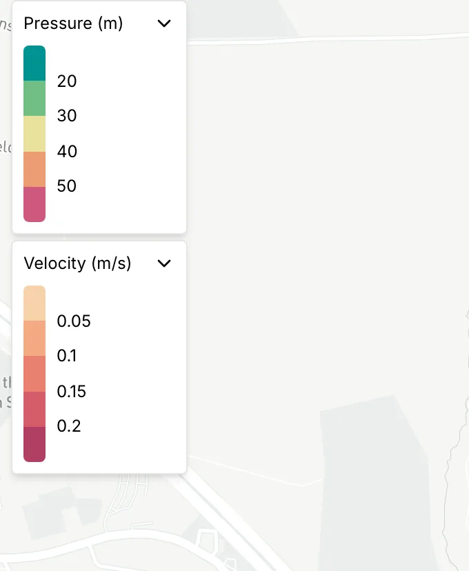
Section titled “The legend”Each color rule puts a legend at the top left of the map. The title of the legend is the property with its unit, and the ramp and the break values are under the title. Click a legend to collapse it to its title. Click it again to bring the ramp back.
On a narrow window the app draws no legends over the map. The ramp appears in the side panel instead, in place of the Range and Ramp rows.
Range: how values become classes
Section titled “Range: how values become classes”The Range row shows the mode and the number of classes, for example
Pretty breaks, 5. Click the row to open a popover with the whole
classification.
Mode sets how the app chooses the breaks:
| Mode | What it does |
|---|---|
| Pretty breaks | Rounds the breaks to values that read well: 10, 20 and 30 in place of 11.3, 22.6 and 33.9 |
| Natural breaks (ckmeans) | Looks for the gaps in the data and breaks there, so similar values stay in one class |
| Equal quantiles | Puts about the same number of assets in every class. This is useful when the data is skewed |
| Equal intervals | Splits the range from minimum to maximum into equal-width classes |
| Manual | The mode changes to this as soon as you type a break yourself |
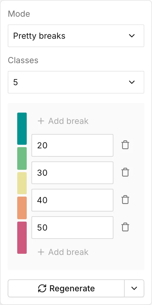
Classes takes 3 to 7. Under the two selectors is the interactive legend. It is a column of color blocks with the break values between them.
- Click a break value and type a new one. The mode changes to Manual and stays there until you choose another mode.
- Click a color block to open a color picker with a hex field in it.
- Press Add break above or under the column to split the range further. Click the delete icon beside a break to merge the two classes it separates. The 3-to-7 limit applies to both.
- The color at each end of the column covers every value beyond the outermost break, so no value is ever left uncolored.
Breaks must ascend. If you type one out of order, the map stops updating until you correct it. A notification shows Invalid range, and the reason appears under the classes. Not enough data. means the mode you chose needs more distinct values than the model has. Choose Manual and set the breaks yourself, or color by a property the model has more of.
Regenerate
Section titled “Regenerate”Regenerate calculates the breaks again from the data, with the mode and the class count you have. If the model changes so much that the old breaks put everything in one class, use it.
For a simulation property on an extended period run, a menu beside Regenerate adds two more choices. The three choices read different timesteps:
- Regenerate uses the first and last timesteps.
- Regenerate from current step uses the timestep that the time browser shows. The breaks then suit that step, and they look wrong at other steps.
- Regenerate from all data reads every timestep of the run. Only this choice gives a ramp that holds for the whole run, so it is the one to use for a playback. It is also the slowest, because it reads the whole results file.
Ramp: which colors
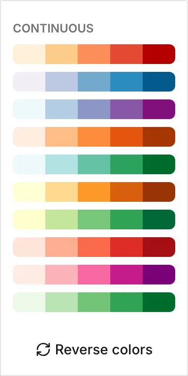
Section titled “Ramp: which colors”The Ramp row opens a list of palettes in two groups. Continuous ramps run light to dark through one or two hues. They suit anything that reads low to high, such as pressure, velocity and elevation. Diverging ramps put a neutral color in the middle and darken towards two contrasting ends. They suit anything you read against a target: pressure against a minimum, headloss against a design value.
The list scrolls, and Diverging is out of sight when the list opens. Reverse colors at the bottom of the list flips the ramp end for end. The breaks do not change.
Each property has its own ramp and mode the first time you choose it. Elevation, pressure and diameter do not all arrive with the same colors. If you switch Color by to another property and back, the breaks, colors and ramp you set for the first property come back with it. The app keeps them for the session, not in the file.
Default color
Section titled “Default color”With Color by set to None there is no ramp. The section shows Default color instead, which is one color for every node, or every link. When the attribute has no value on an asset, a color rule draws that asset in the same color. A pipe with no roughness is an example.
Disabled assets ignore both rules, and the app draws them gray. See The asset tab.
Size in the Node symbology section sets how big the app draws junctions. It opens on three controls:
- Min is the radius in pixels at the zoom set under it.
- Max is the radius at full zoom. Between the two zooms the app interpolates the radius, so junctions grow as you zoom in.
- Zoom is the zoom at which the app starts to draw junctions. Under this zoom it draws none. The default is 12, which keeps a large network readable when you look at all of it.
The slider shows the current map zoom on the same scale. You can see where you stand against the threshold you set. The app draws tanks, reservoirs, pumps and valves as icons, and these controls do not change them.
Label by
Section titled “Label by”Label by writes a value beside each asset on the map. It takes Label, which is the id of the asset, or any property on the Color by list. You can color by one property and label by another. None turns the labels off.
The app draws labels from zoom 15 in. Under that zoom the map shows no labels, whatever Label by is set to.
The label rule is independent of the color rule. If you change Color by, or clear it, the labels stay where they are. See The asset tab for the ids themselves.
Customer points
Section titled “Customer points”The Customer points section has one control, Visible. It draws or hides every customer point on the map. When you hide them, the app also drops every customer point out of the current selection. While they are hidden, Select in map on the Customer points data table does nothing. See Customer points and Data tables.
Zone symbology
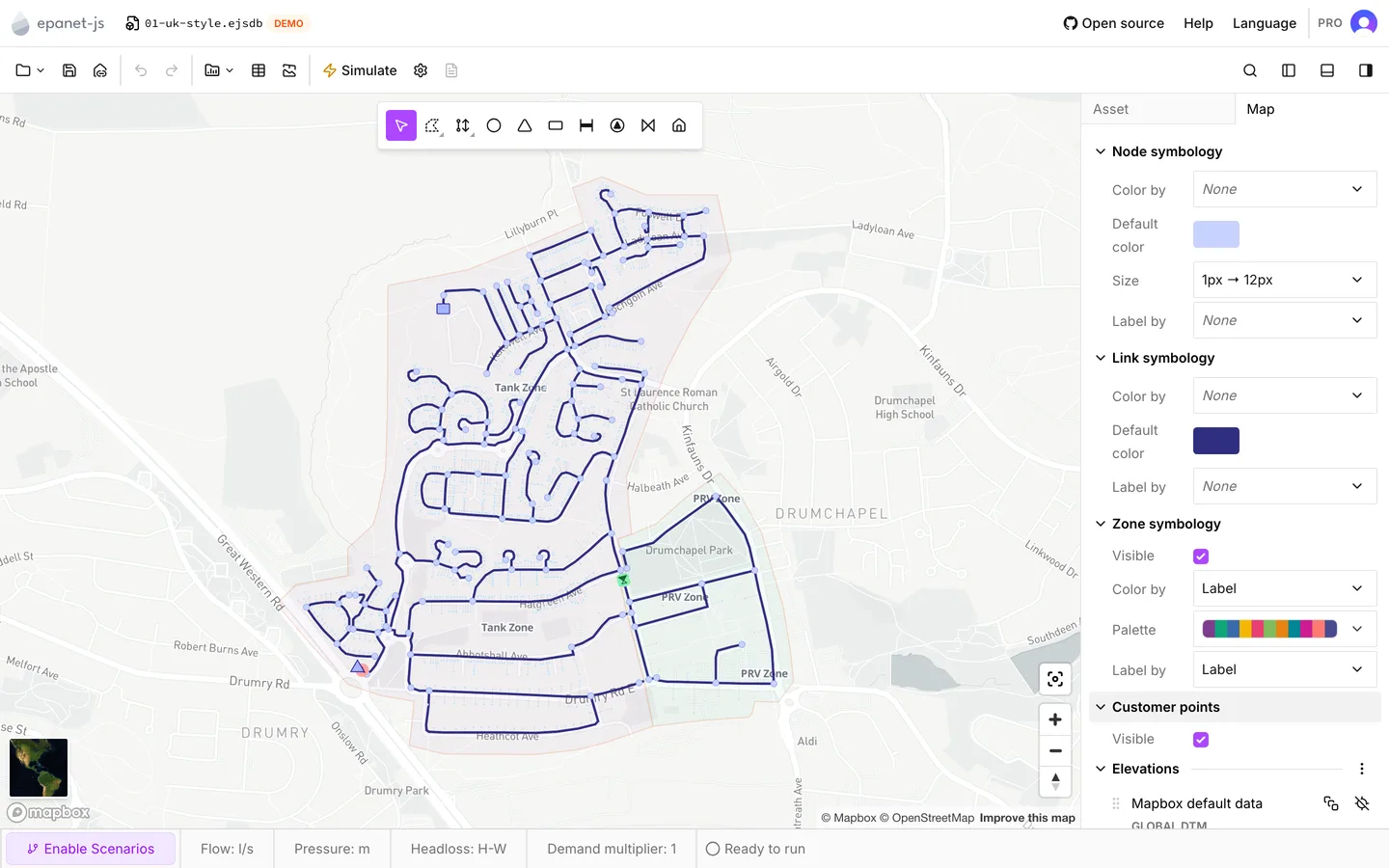
Section titled “Zone symbology”A project that has zones, on a plan that allows them, gets a Zone symbology section. The section holds three controls:
- Visible draws the zone polygons or hides them.
- Color by set to Label gives each zone its own color from a Palette of qualitative ramps.
- Label by set to Label writes the zone names on the map.
With Color by set to None, the section offers a single Default color for every zone instead. See Zones.
What symbology is not
Section titled “What symbology is not”Symbology is a view, not part of the model. The app does not write the color
rules, the breaks, the label rules or the node size to the project file or to an
exported INP. None of it survives a reload. Two people who open the same
.ejsdb see the same network with no coloring on it, and a run colors nothing by
itself.
This matters when you spend time on a ramp you need again. Write down the breaks, or build the ramp again from Regenerate next time. It also means you can experiment freely, because nothing you do here can change a result.
- Reading results — how to step through and play back an extended period run under the ramp you set.
- Graphs — the same results as a series rather than a color.
- The map and its layers — base maps and your own layers, under all of this.