
HGL profile
An HGL profile is a long section through the network. The horizontal axis is distance, with the ground and the pipe elevation along it. After a run, the hydraulic grade line is drawn above them. This is the view for questions about head rather than about one asset:
- Where the network loses head.
- What the pump lifts the head to.
- How much pressure is left at the far end of a main.
You pick a start and an end on the map, and the app finds the path between them. The profile opens in the bottom panel, beside the data tables. It follows the timestep that the time browser shows. For the meaning of a hydraulic grade line, see the EPANET 2.2 manual.
Drawing one
Section titled “Drawing one”HGL profile is in the toolbar, to the right of Data tables. It has no keyboard shortcut. When you press it, the panel opens and the map goes into profile selection at the same time. The next thing you click is the start of the profile.
-
Press HGL profile
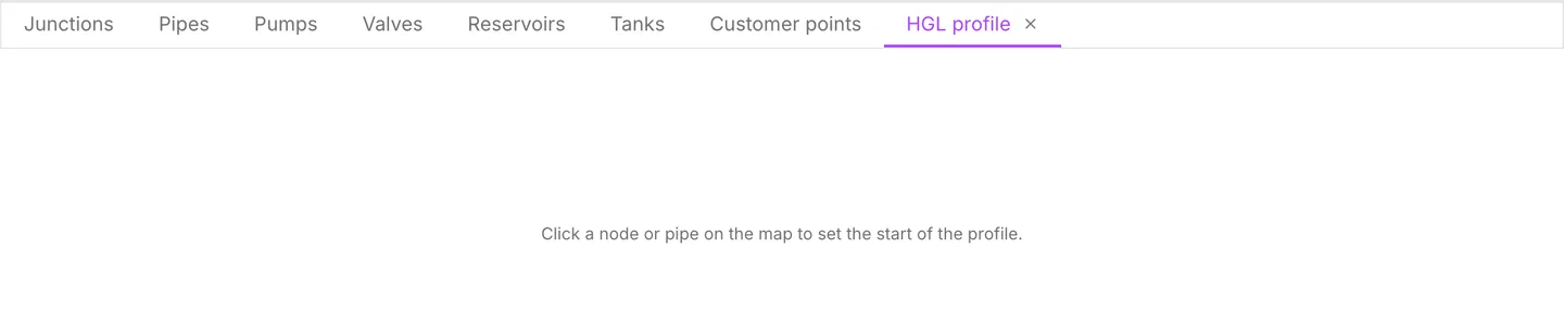
Section titled “Press HGL profile”The bottom panel opens on the HGL profile tab. The map shows Click a node or pipe to set the start of the profile.
-
Click the start
Section titled “Click the start”Click a node, or click a pipe. When you click a link, the app takes the end of the link nearest to the point you clicked. As a result, you do not have to click exactly on a junction. The hint changes to Click to add a waypoint, or double-click to finish the profile.
-
Click the end
Section titled “Click the end”The app draws the profile as soon as there are two points. It also selects the whole path on the map, so you can see the route it chose.
-
Add waypoints, or finish
Section titled “Add waypoints, or finish”Each further click extends the profile from its current end to the node you clicked. To leave selection mode, double-click or press Esc. The profile stays on screen either way.
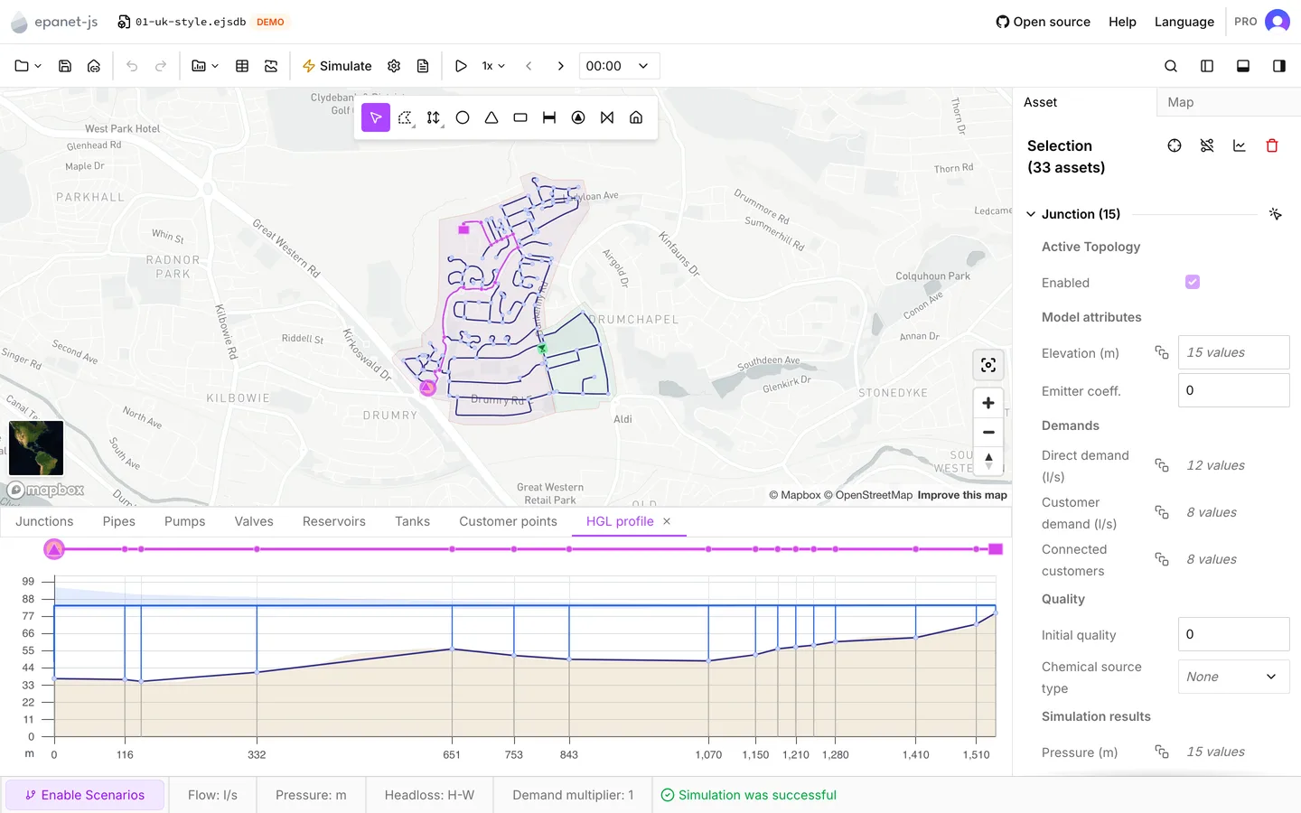
Waypoints make the profile follow the route you have in mind, and not the route the app picks on its own. The app works out each leg separately. A leg cannot come back through a node that the profile already used. As a result, a profile never doubles back on itself.
The app cannot always get to a node from the current end of the profile. When you hover over such a node, the cursor changes to the “not allowed” symbol. Thus you can see which nodes are on a connected route before you click.
The path it picks
Section titled “The path it picks”Between two points the app takes a single route. The route it takes depends on whether there are results:
- After a run, the app follows the water. Of the routes available, it prefers the one through the links that carry the most flow. That route is usually the trunk main, which is usually the profile you wanted.
- With no results, the app takes the shortest route by pipe length.
Either way, the app never uses a link that is disabled. A profile runs only through the active topology. A pipe that a control leaves closed is not ruled out in the same way, because its status is an outcome of the run and not a property of the model. But such a pipe carries no flow. After a run, the route keeps away from it wherever there is an alternative.
Each time you run the model again or change it, the app works out the route afresh from the points you picked. As a result, a profile drawn before a change can move after the change.
Reading the chart
Section titled “Reading the chart”The horizontal axis is distance along the path. The app adds up the Length of each pipe on the path, so these are the model’s lengths and not the straight-line distance across the map. The vertical axis is in the project’s elevation unit. It fits the data it holds, and it does not start at zero.
The chart shows up to five things:
| What | How it appears |
|---|---|
| Node elevations | A line that joins the nodes on the path, with a marker at each node |
| The ground | A shaded band underneath, sampled along the route |
| The hydraulic grade line | A blue line across the top, after a run |
| Pressure head | A vertical drop from the grade line down to each node |
| The range of head | A pale blue band around the grade line, on an extended period run |
The app gets the shaded ground from the same elevation service that the elevations editor uses. It samples the ground between every 5 m and every 200 m along the route, depending on the length of the route. The ground arrives a moment after the profile. For a model with no projection, the app does not get the ground at all. See Projections.
On an extended period run the pale band is the most useful thing on the chart. It is the lowest and the highest head that each node reached across every timestep of the run. Thus it shows the whole day’s envelope behind the single moment that the line draws. The band appears only when the run produced more than one timestep.
The strip
Section titled “The strip”Above the chart is a schematic of the same path. The pipes are a bar, with symbols for the pumps, valves, tanks, reservoirs and junctions on the path. Each symbol sits at its distance along the axis. The strip shows selected assets in the selection color.
The strip thins itself out as it gets crowded. It drops junctions when there is less than 18 px between them. It drops valves other than PRVs when there is less than 48 px. When you zoom in, they come back. The strip always draws the pumps, the PRVs, the tanks and the reservoirs.
The tooltip
Section titled “The tooltip”When you hover over the chart, the tooltip reads out the values under the cursor. The app shows the marker on the map as well, so you can see where you are on the network.
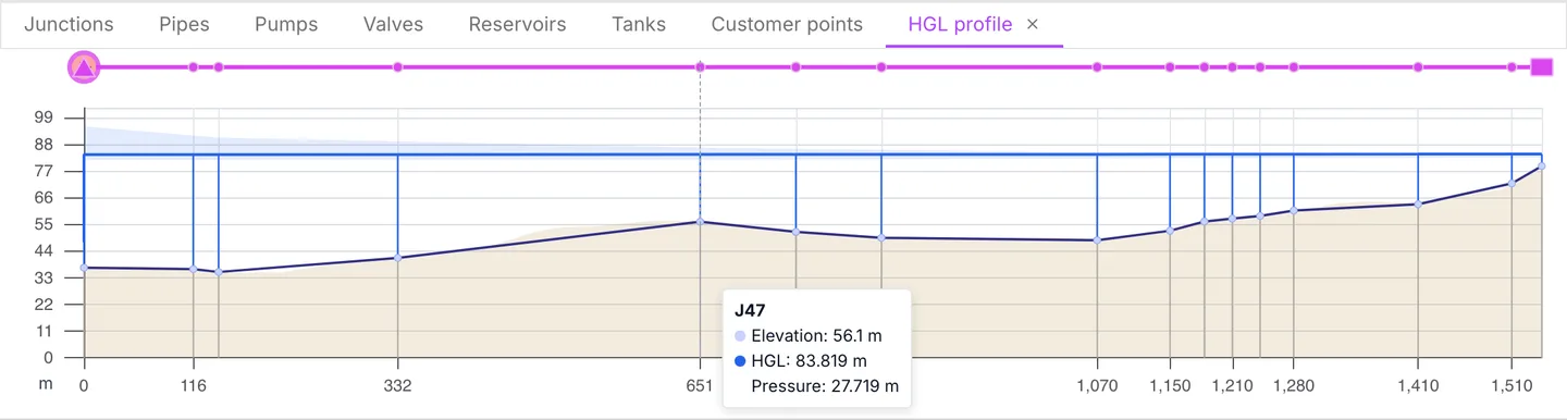
- Over a node: the label of the node, Elevation, and, with results, HGL and Pressure.
- Between nodes: the label of the pipe, marked Estimated, and values interpolated between the nodes on each side.
- Over a pump or a valve: the label and the ground elevation only. The app does not estimate head and pressure across an asset that changes them.
A worked reading
Section titled “A worked reading”The Drumchapel demo has a profile worth taking as an exercise. It goes from the
tank T1 down to J126, at the far end of the pressure-reduced district. The
path is about 1.7 km of main. Along it the ground drops roughly 60 m: T1 sits
at 79 m and J126 at 19.2 m. The pressure-reducing valve V1 is in the middle
of the path.
First, run the model with Time analysis mode set to EPS - Extended period
simulation, so that the grade line and the band are both there — see
Simulation settings. Then click T1, then J113, then
J126. The waypoint J113 makes the route go through the valve.
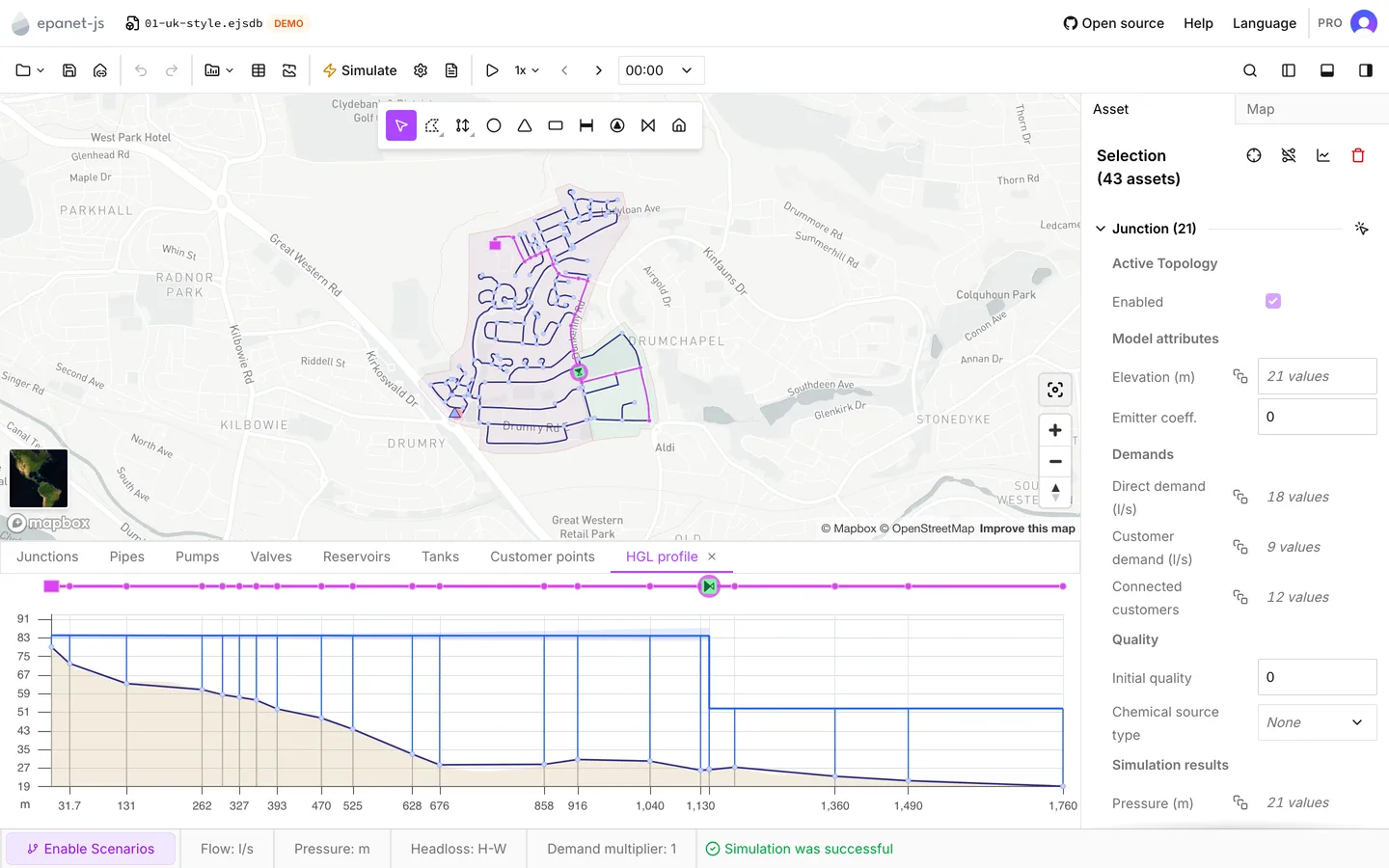
There are three things to read off the chart:
- The gap between the grade line and the nodes. In a healthy profile, the grade line stays above the elevation line for the whole path. At each node, the drop from one line to the other is the pressure there, and the tooltip gives the same figure. Where the two lines come together the pressure is going, and where they meet there is none left.
- The steps. A pipe loses head along its length, so friction is a slope. A tank,
a pump or a valve changes head at one point, so it is a step. When you read
the chart from left to right, you see where the head in this district is
decided. Here it is decided at
V1, and not at the tank above it. - The width of the band. On an extended period run the pale band is the range of head each node reached over the whole run. A narrow band is a node whose head barely moves all day. A band that gets wider along the path is head lost to friction that grows with demand, which is a case for a larger pipe or for a look at what adds the losses.
A district behaves when three things are true. The profile stays well above the ground the whole way. The step is where you expect it. The band is narrow. Everything else on the chart is a question about which of these three is not true.
Moving around it
Section titled “Moving around it”| Action | What it does |
|---|---|
| Scroll wheel over the chart | Zooms the horizontal axis about the cursor |
| Click an asset in the chart or the strip | Selects it and opens the Asset tab |
| Shift and click | Adds it to the selection, or removes it from the selection |
| Right-click | Zoom to and Select path |
You can select an asset on the path from somewhere else, such as the map, a data table or the search. If the asset fell outside the zoom window, the chart scrolls to it. Thus the chart and the map stay in step.
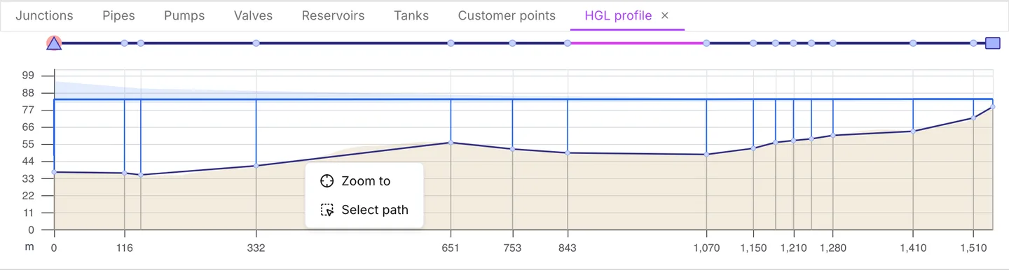
Zoom to fits the map to the whole path. Select path selects every asset on the path. This is how you get from a profile to a multi-asset selection worth graphing or editing. When the whole path is already selected, Select path is hidden.
When you click an asset in the chart, the app also leaves profile selection mode. Thus a click that is meant to inspect an asset does not extend the profile by accident.
The elevation line, the grade line and the tooltip all read the timestep that the time browser shows. They move as you step through the run or play it back. The pale band does not move, because it is the whole run by definition. See Reading results.
With no results at all, the chart still draws the ground, the node elevations and the strip, and nothing else. This is a legitimate way to use the chart while you build a model. It lets you make sure that the elevations along a main are sensible before the engine solves anything.
When it has nothing to draw
Section titled “When it has nothing to draw”The panel shows a line of text instead of a chart:
- Click a node or pipe on the map to set the start of the profile. The panel is open and waits for the first click.
- Click a node or pipe on the map to set the end of the profile. The profile has one point.
- Some assets in this profile no longer exist. Create a new profile to continue. An asset that the profile ran through was deleted. The app cannot repair the profile, so draw another one.
- No data. The panel is open, there is no profile, and the map is not in selection mode. You get this after you switch to another bottom tab and back.
Closing it
Section titled “Closing it”Like every tab in the bottom panel, the HGL profile tab has an × on it, labeled Close HGL profile. This control deletes the profile and closes the tab. When you switch to another tab in the bottom panel, the app leaves selection mode but keeps the profile. When you switch back, the profile is still there. When you press HGL profile in the toolbar again, the app always starts a new profile. It does not return to the last one.
- Reading results — the time browser that the profile follows.
- Graphs — head against time for one asset, rather than against distance for many.
- Symbology — pressure across the whole network at once.
- Elevations — where the node elevations under the profile come from.