
Graphs
A result at one timestep is a number in a panel. A result over the whole run is a graph. The app draws two kinds:
- The Quick graph at the foot of the Asset tab, for one asset at a time
- Custom graph, a dialog that plots a whole selection at once
Both graphs need an extended period run. A steady state run has a single moment in it. The quick graph then does not appear at all, and the custom graph opens on Graphs are only available in extended period simulations (EPS). See Simulation settings for the Time analysis mode and Total duration that decide this. See Running a simulation for the run itself.
Which one
Section titled “Which one”| Quick graph | Custom graph | |
|---|---|---|
| Assets | The one selected | The whole selection, up to 100 |
| Properties | Everything the asset type reports | Pressure or Head for nodes, and one link property |
| Where | Inline, at the foot of the Asset tab | A dialog over the app |
| Moves the run | Yes, click a point | No |
| Export | None | PNG, CSV or XLSX |
The quick graph gives more depth on a single asset. It plots a tank’s Level and Volume, a pump’s Relative speed and Status, and a junction’s Actual demand. A custom graph plots none of these. The custom graph is for comparison: the pressure at twenty junctions on one axis, and the pipes between them on another.
The quick graph
Section titled “The quick graph”When you select a single asset, and the last run produced more than one reported timestep, the quick graph appears. It is the last section of the Asset tab, below Simulation results. You do not turn it on. If it is not there, either you ran nothing, or the run was steady state.
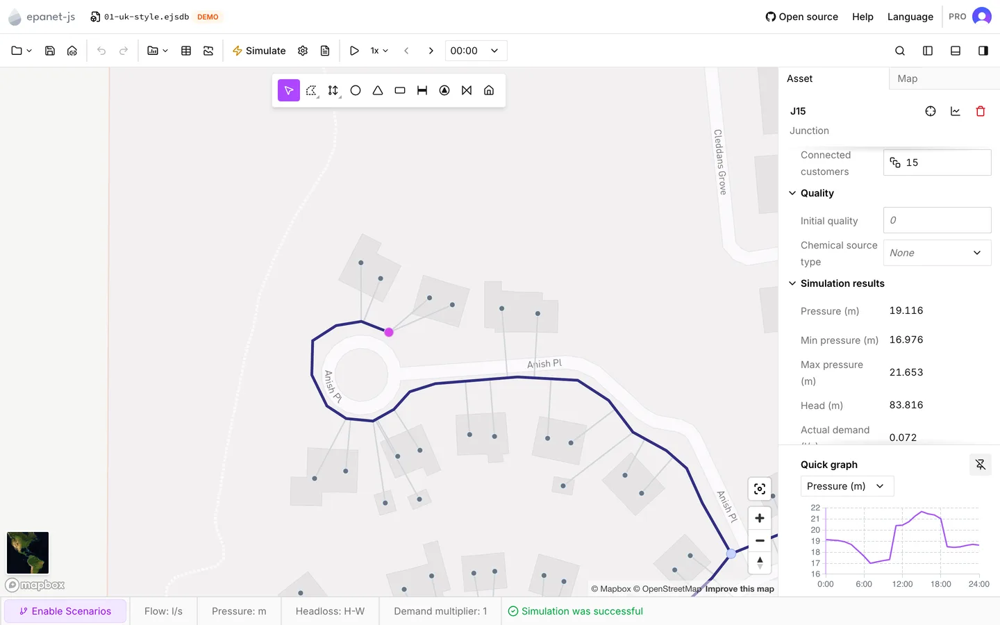
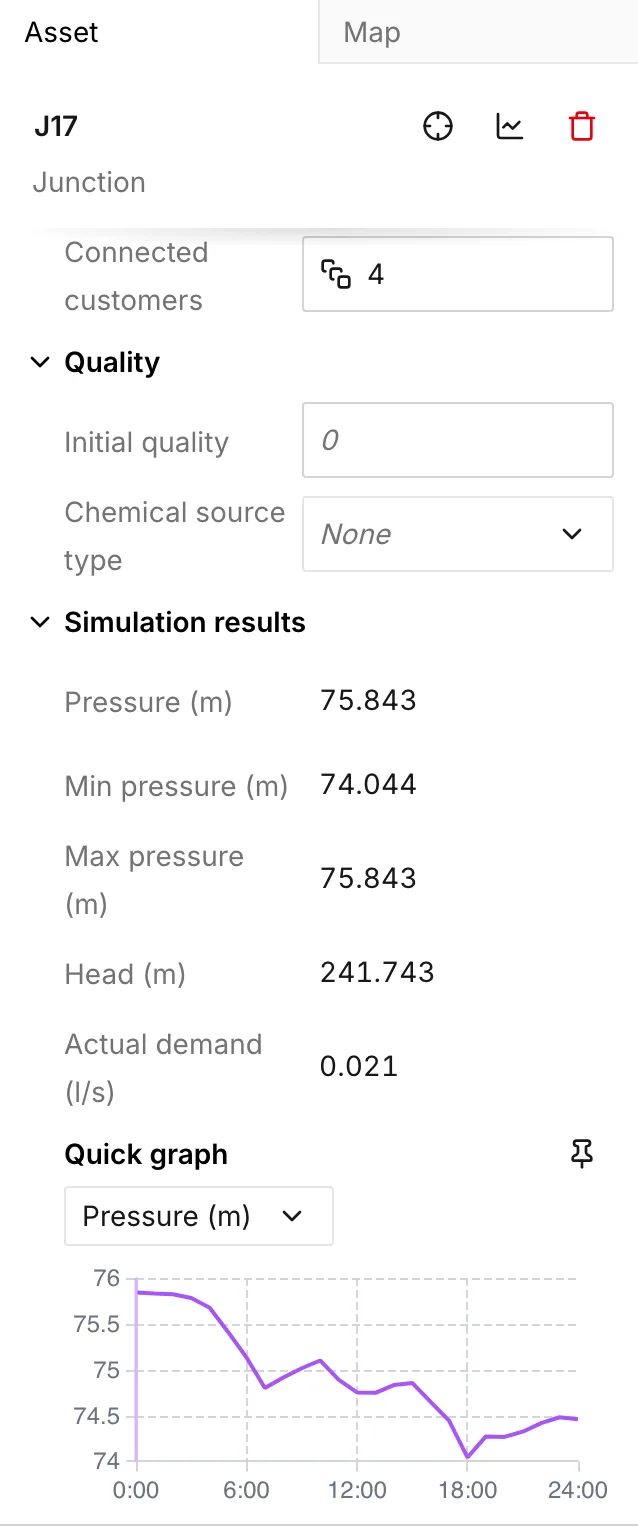
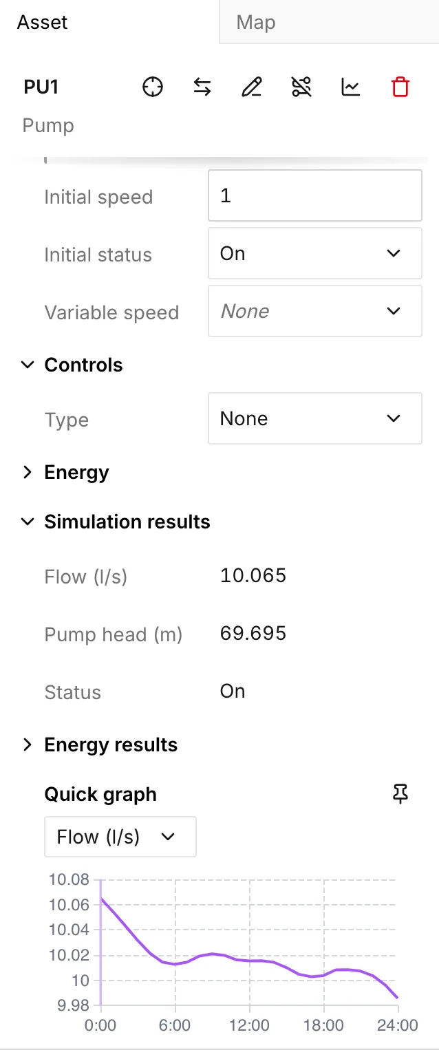
The selector under the heading sets what the graph plots, and each option carries its unit. The options depend on the asset type:
| Asset | Properties |
|---|---|
| Junction | Pressure, Head, Actual demand |
| Pipe | Flow, Velocity, Unit headloss |
| Pump | Flow, Pump head, Relative speed, Status |
| Valve | Flow, Velocity, Headloss, Setting |
| Tank | Level, Volume, Net flow, Pressure, Head |
| Reservoir | Pressure, Head, Net flow |
A valve’s Setting carries the unit that its type implies: pressure for a PRV, PSV or PBV, and flow for an FCV. As a result, the same row means different things on different valves. See Valves.
The graph draws a pump’s Status against two labeled positions, On and Off, and not against a numeric axis. This is the quickest way to see a pump that cycles.
When the run included a water quality analysis, one more property appears: Water age, Water trace or Chemical, whichever you ran. If you run again without it, the graph goes back to the default property of the asset type, and it does not show an empty graph. See Water quality.
Reading it
Section titled “Reading it”The horizontal axis is the elapsed time from the start of the run. It is the same clock that the time browser uses. The graph draws the whole run, whatever timestep you are on.
The vertical axis fits the range of the series, and it is not anchored at zero. A tank level that moves between 4.1 m and 4.4 m fills the whole graph. You must read the axis before you read the shape.
A vertical line marks the timestep you are on. When you point at the graph, it shows the value at that time. When you click a point, the whole model moves to that time. This is the quickest way to get from a peak on the graph to the state of the network at the moment it happened. See Reading results.
Pinning it
Section titled “Pinning it”Pin lifts the graph out of the scrolling column and fixes it to the bottom of the panel. It stays there as you select one asset after another. You can then compare the same property across several assets, and you do not scroll to the graph each time. On a window wider than 640 px, you can also drag the top edge of the pinned graph to make it taller or shorter. Unpin puts it back.
The app remembers the property you choose for each asset type. A tank still shows Level, and a pump still shows Flow, after you move away and come back.
When it has nothing to draw
Section titled “When it has nothing to draw”No data available means that the asset has no series for the property, for example a pipe you drew after the run. Error loading data means that the app cannot read the stored results. Run the model again.
In a scenario
Section titled “In a scenario”In a scenario the graph draws two lines: the branch you are on in color, and Main behind it in gray. A legend names both. The graph needs a run of Main as well, because that run is the comparison. See Scenario work.
Custom graphs
Section titled “Custom graphs”View graph opens Custom graph for the current selection. The action is in three places:
- The header of the Asset tab, for a single asset
- The header of the multi-asset panel, for a selection
- The right-click menu on the map
See Selection and search for the ways to build a selection worth graphing: an area drag, a flow trace, or a search.
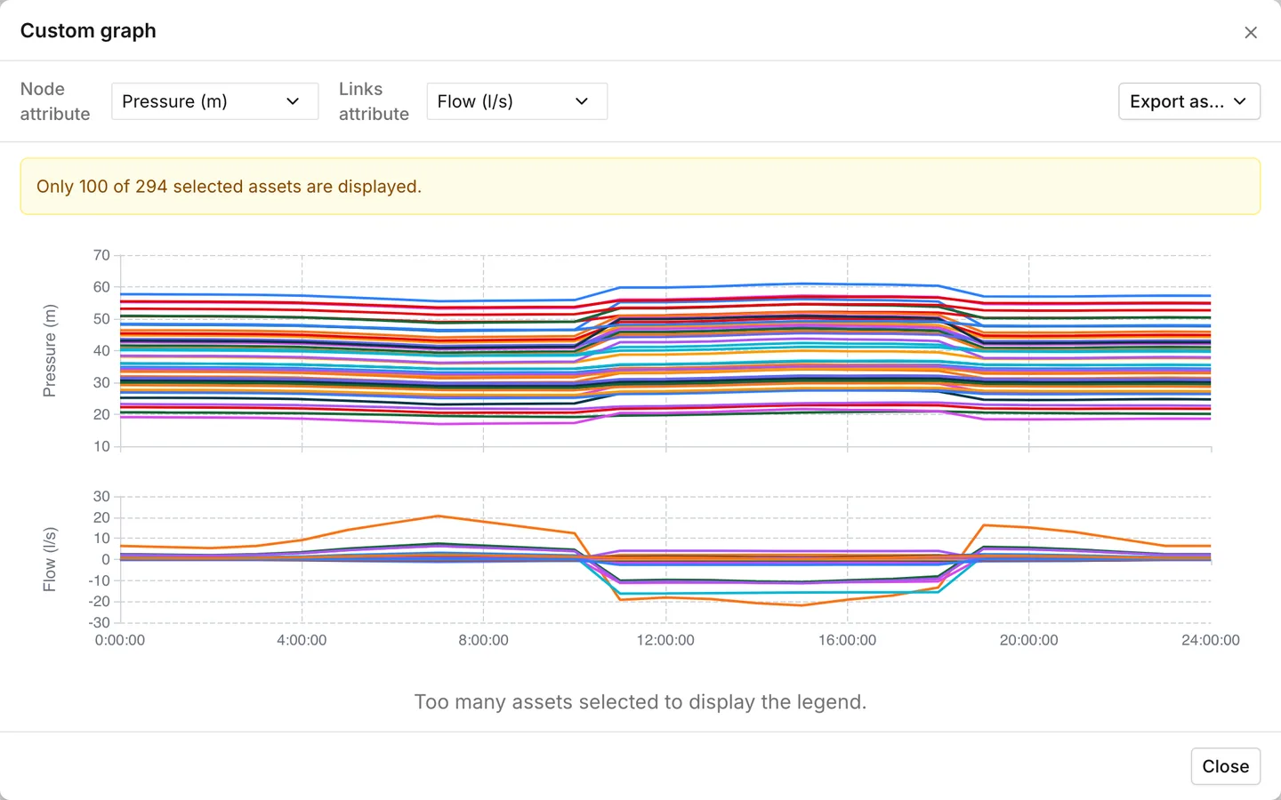
Node attribute and Links attribute are across the top of the dialog. Each one appears only when the selection holds that kind of asset:
| Selector | Options |
|---|---|
| Node attribute | Pressure, Head |
| Links attribute | Flow, Flow (absolute), Velocity, Unit headloss, Status |
When the run had a quality result, the app adds it to both lists: Water age, Water trace or Chemical.
Flow (absolute) plots the magnitude and discards the sign. When you graph several mains together, and one of them runs backwards, this is what you want. The graph draws Status as a step between Closed and Open, and not as a number.
When you select nodes and links together, the dialog stacks two graphs, one for each kind, on a single time axis. When you point at one graph, both graphs show their value. As a result, a pressure and the flow that caused it line up without any work.
The two caps
Section titled “The two caps”A custom graph draws 100 assets at most. When you select more, the dialog draws the first hundred. It splits them between nodes and links in the same proportion as the selection, and it says so above the graph: Only 100 of 294 selected assets are displayed. A narrower selection is the only way to see the rest.
With more than twelve series, the graph drops the legend and puts Too many assets selected to display the legend. underneath. The tooltip then lists the first twelve assets with a count of the others. Twelve is the practical limit for a graph you want to read and not skim.
Exporting
Section titled “Exporting”Export as… offers three things.
- Image (.png) saves the graph as you see it. When there are two graphs, it saves both.
- Comma-Separated Values (.csv) and Microsoft Excel spreadsheet (.xlsx) save the numbers instead: one row per asset, one column per reported timestep. They hold exactly the assets in the graph and the properties on the two selectors. CSV arrives as a zip with one file per property. XLSX arrives as a single workbook. After the app writes the file, a notification shows Export succeeded.
This is the same exporter as File > Export > Simulation results, narrowed to a selection and two properties. The file has the same shape as a full results export. See Import and export for the whole-model version.
When it has nothing to draw
Section titled “When it has nothing to draw”No data available. Run a simulation to create a graph. means that there are no results at all. The action is always available, so the dialog opens even when there was no run. Graphs are only available in extended period simulations (EPS). means that there are results, but only one moment of them.
- Reading results — stepping through time and playing a run back.
- Symbology — the other way to read a result across many assets: color, at one timestep, on the map.
- HGL profile — head along a path rather than through time.
- Import and export — exporting results for every asset and every property.